Challenge
The site is three pages. For a project of this size, a full Figma prototype would have added documentation without adding clarity. Design thinking happened upfront instead: layout logic was settled through hand sketches before any tool was opened, leaving room for refinement once decisions reached the browser.
The real difficulty was that designing and building simultaneously removes the normal distance between decision and output. There is no handoff stage where gaps become visible. Some decisions only revealed themselves once rendered in the browser, which meant staying flexible without losing the structure established at the start.
Process
Tokens
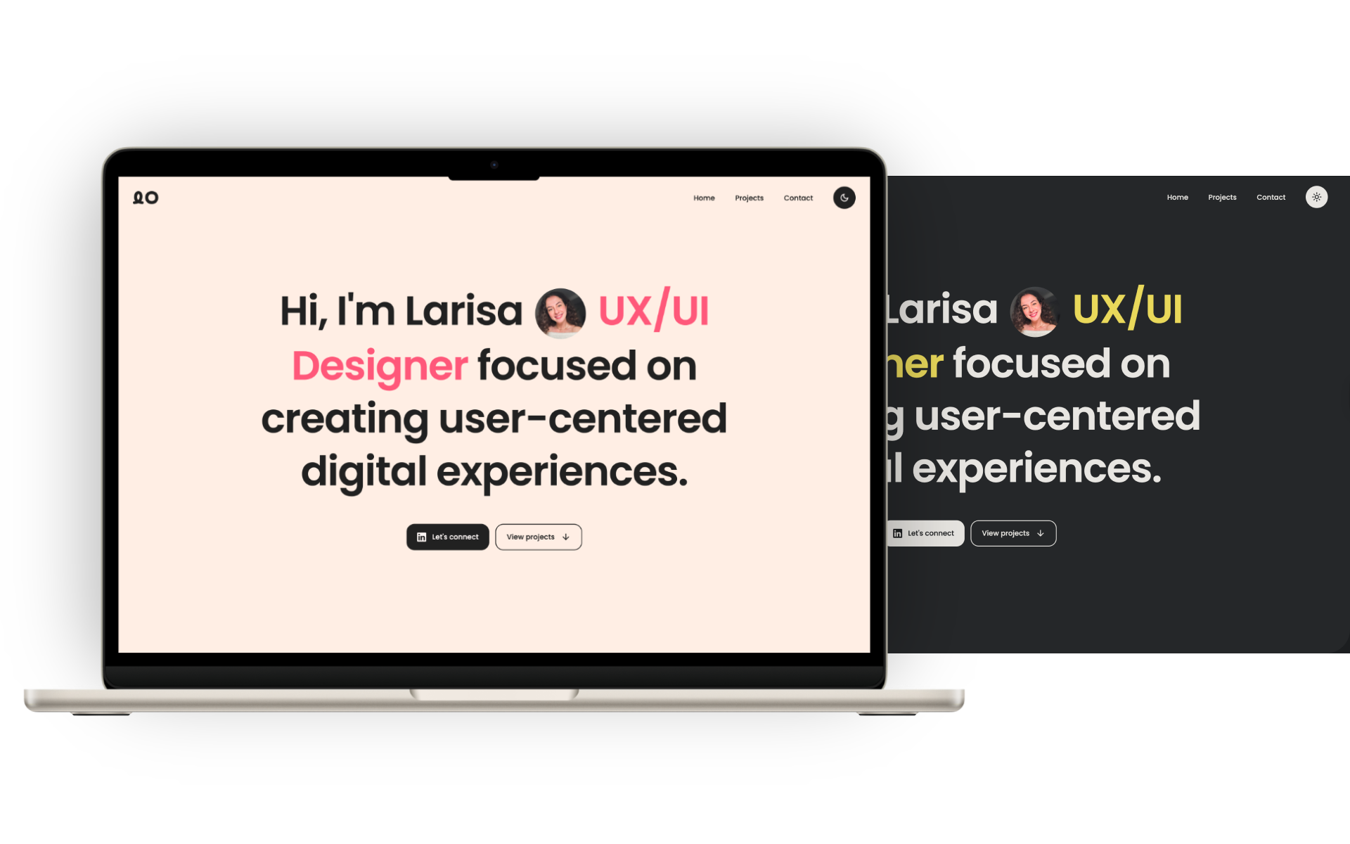
Before writing any code, I defined a base set of tokens: colour variables for light and dark themes, a spacing scale, border radius values, and padding increments. Dark mode was part of the token structure from the start, mapped at the semantic level, so switching themes did not require component-level overrides. That foundation provided a reference for every subsequent decision, rather than leaving values open each time. Some values still needed adjustment once the design came together in the browser: font sizes, section spacing, and a few component behaviours were refined across viewport sizes. The tokens made those adjustments traceable rather than arbitrary.
Claude in VS Code
I used Claude in VS Code to scaffold the HTML structure and CSS logic, treating each prompt as a precise design instruction. When the output did not match the intended result, I iterated directly in the browser. Typography across breakpoints needed the most rounds of adjustment, with several components requiring targeted overrides at mobile and tablet sizes.
Accessibility
I approached accessibility as a structural consideration from the start, using semantic HTML and giving attention to keyboard navigation and heading hierarchy throughout the build. The primary brand colour does not meet WCAG contrast requirements against the background. It is used sparingly, and the rest of the interface meets the standard.
Outcome
The portfolio is live, responsive, and version-controlled on GitHub. The project gave me direct, practical knowledge of how design tokens translate into code and how AI can execute frontend logic without replacing design judgement. The next step is rebuilding it in React and Tailwind, taking the same systematic approach into a component-based workflow and using AI-augmented development to build a genuine understanding of both frameworks from the ground up.