Product
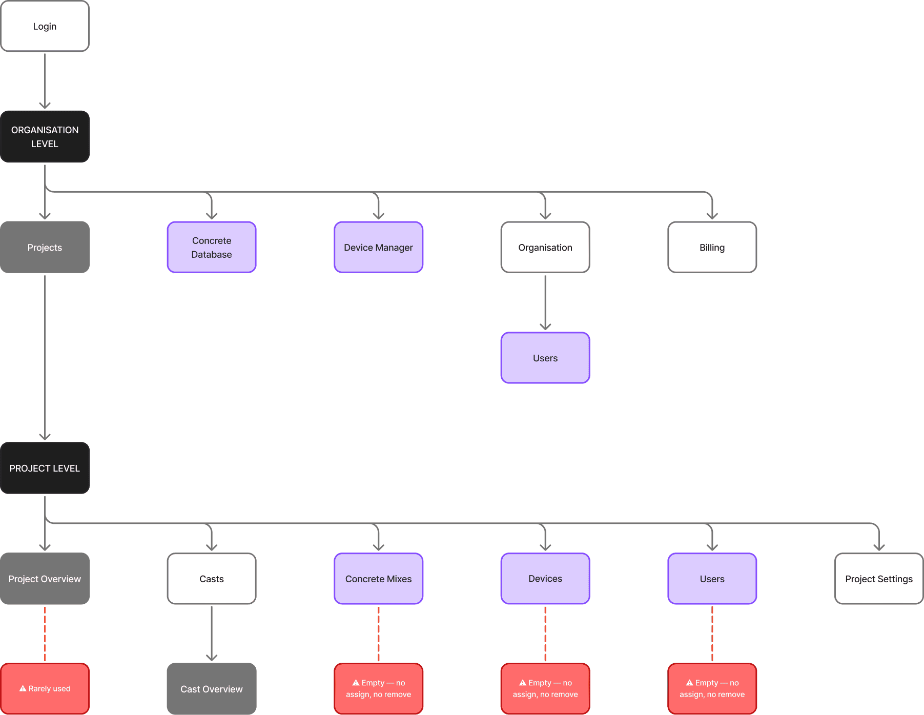
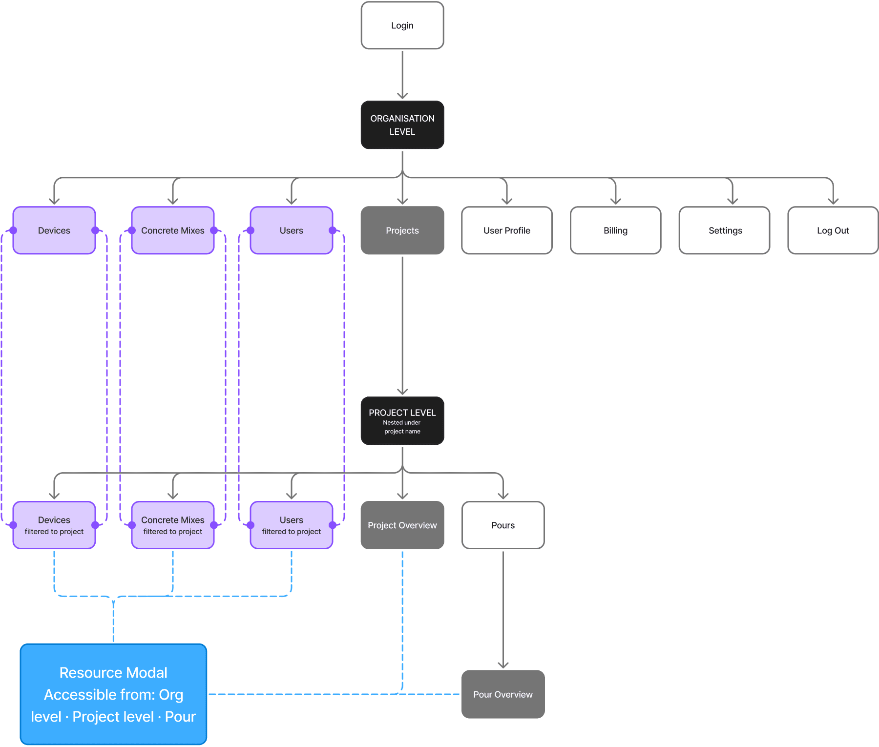
Maturix Insitu is a web platform for construction teams to monitor concrete curing in real time. Sensors embedded in concrete transmit temperature, maturity, and strength data to the platform, where site teams track progress, set alarms, and make time-critical decisions: when to strip formwork, whether a pour is developing correctly, and whether a device has failed in the field. The platform has two levels: organisation and projects. At the organisation level sit shared resources: devices, concrete mixes, and users. At the project level sit the active job sites, each with multiple pours(=casts), each pour with one or more monitoring points tied to a physical device.
Challenge
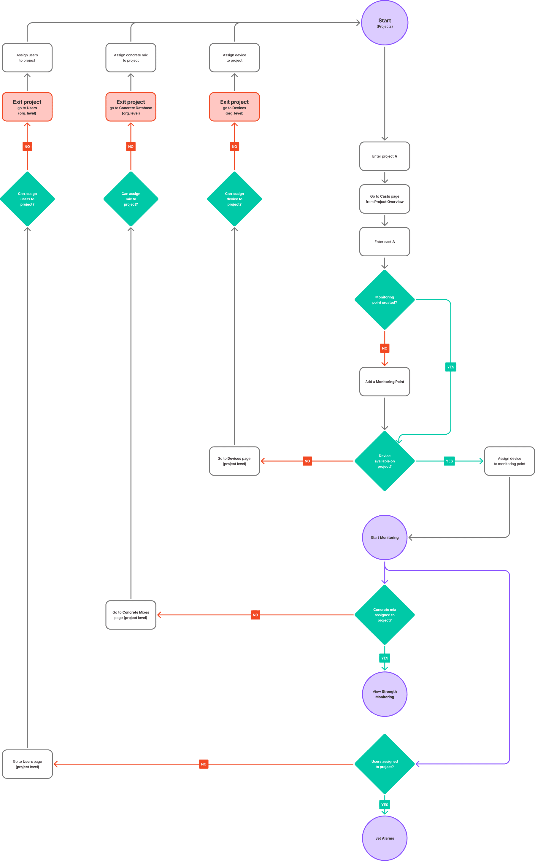
The platform was not broken in an obvious way. It had everything it needed. The problem was that nothing connected, and users had no way of knowing that until they were already stuck. To start a monitoring point, a user needed a device, a concrete mix, and at least one user assigned to the project to receive alarms. Nothing prompted any of this. The platform did not even assign the person who created a project to it by default. The result was a predictable failure: users would build their setup, reach the final step, and only then find that a required resource was missing. They would leave the project, fix it at the organisation level, navigate back, and hit the next missing piece. Experienced users had normalised this and built workarounds. New users had not, and that is where the platform was losing people. A second problem sat around devices. Completing a project did not release its hardware. Devices stayed locked inside finished projects until someone manually freed them, creating a recurring resource problem unrelated to the work teams were trying to do.
Process
Research
I ran internal interviews with the sales and operations teams. They had years of accumulated user feedback and a clear picture of where the platform consistently failed. One pattern came up immediately: experienced users had learned to work around the lateral navigation. New users had not, and that gap was where the platform actively lost people. From there, I mapped the existing architecture and traced the most common user paths. The back-and-forth between organisation and project levels was not an edge case. It was a normal experience.
Structural decision
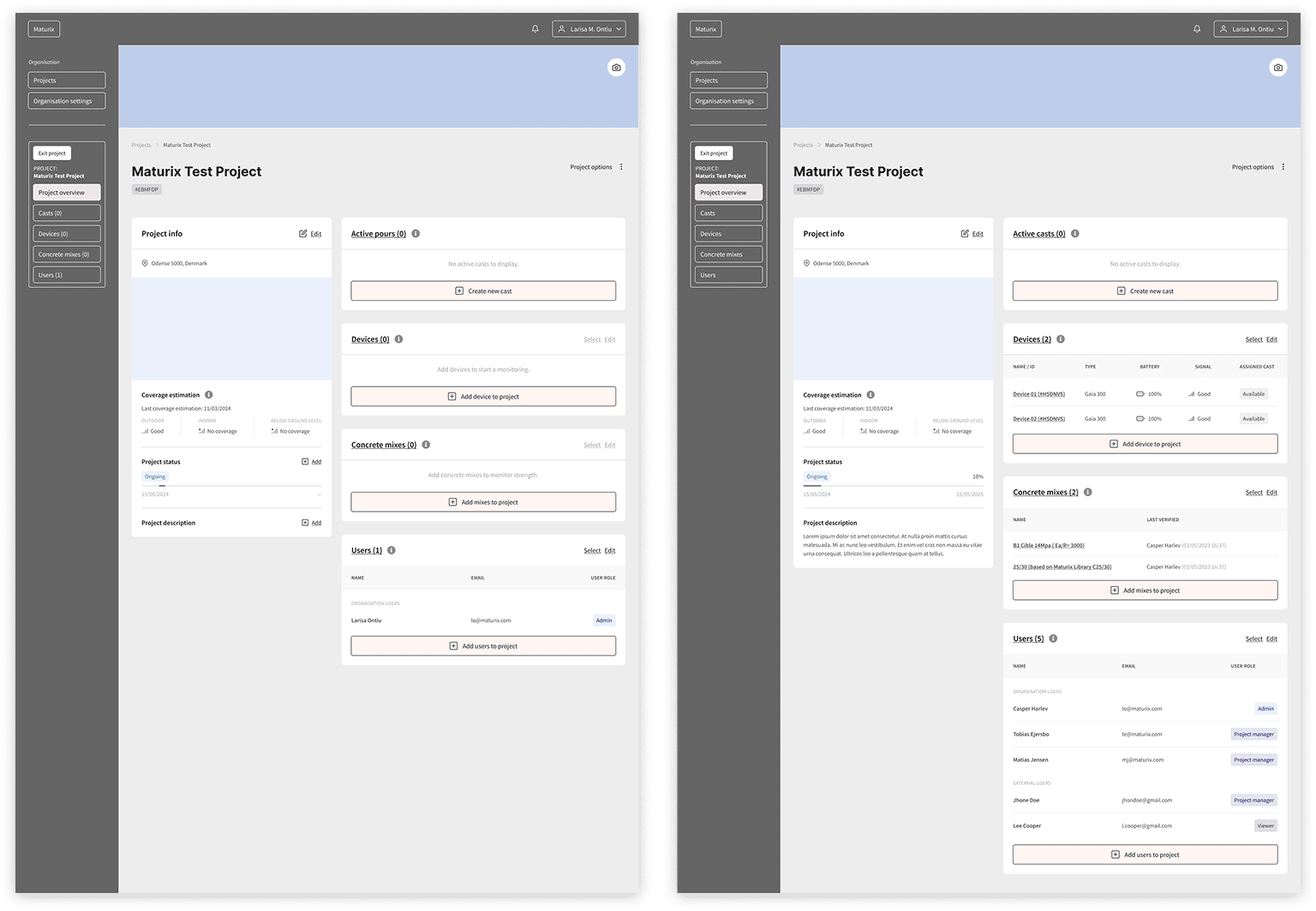
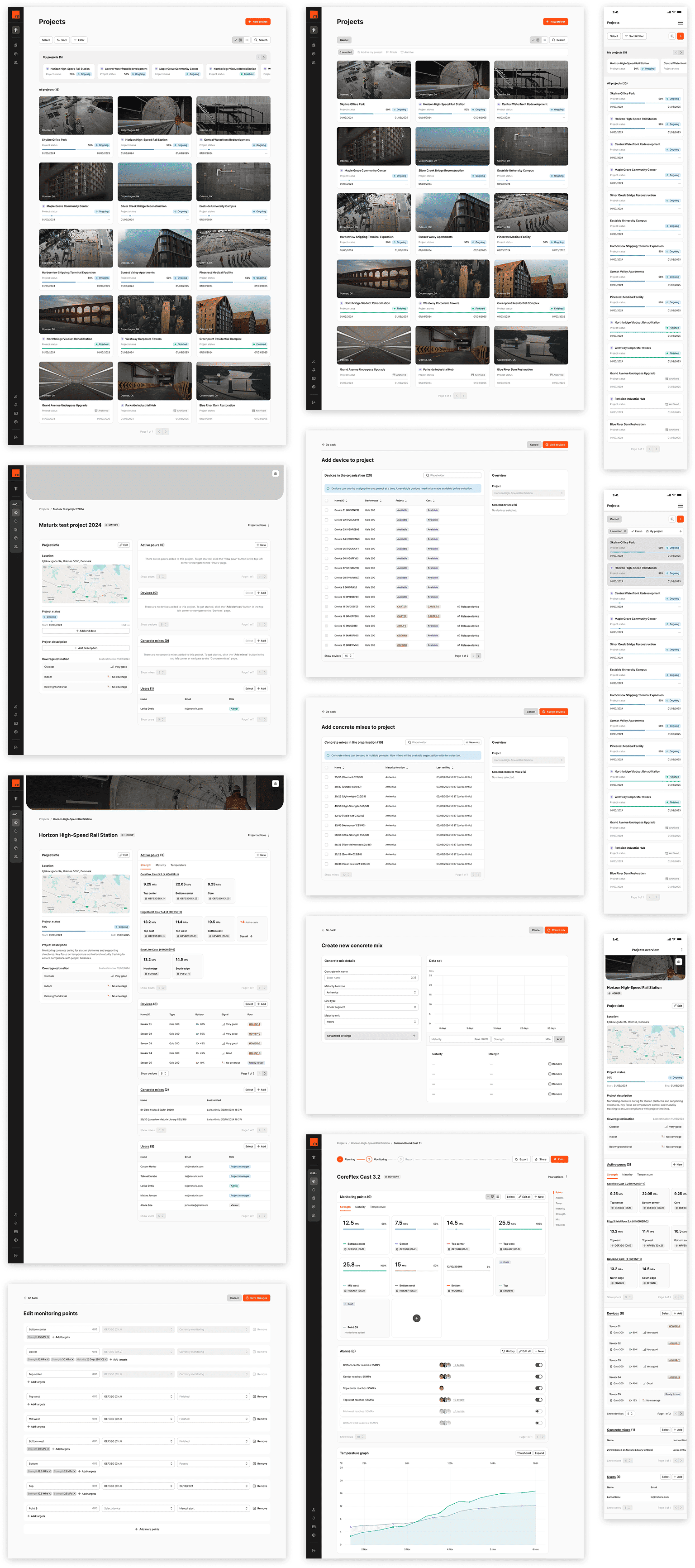
The platform ran on a push model: to work inside a project, users had to push resources into it from the outside, in advance, with no guidance that this was even required. The redesign flipped that. Resources at the organisation level became a warehouse. Project-level resources became a toolbox. Users no longer needed to pre-load a project before entering it. Once inside, they could pull what they needed from within their current task, without leaving their context. Every resource assignment became a modal: device selection, concrete mix, and user assignment, all accessible from within the flow, at the point they were actually needed. Device release worked the same way, with a confirmation step to prevent accidental removal. I consolidated the duplicate resource pages into single pages filtered by context. Same page, same functionality, scoped to the user's context.
Automations
Some failure points were not navigation problems. They were gaps in system logic that put routine operational tasks on users because the platform had no handling for common actions. We introduced several automations: automatically assign the user who creates a project to it; assign users who make substantive edits; when a device is added to a monitoring point, create a standard alarm set for low battery and cable fault.
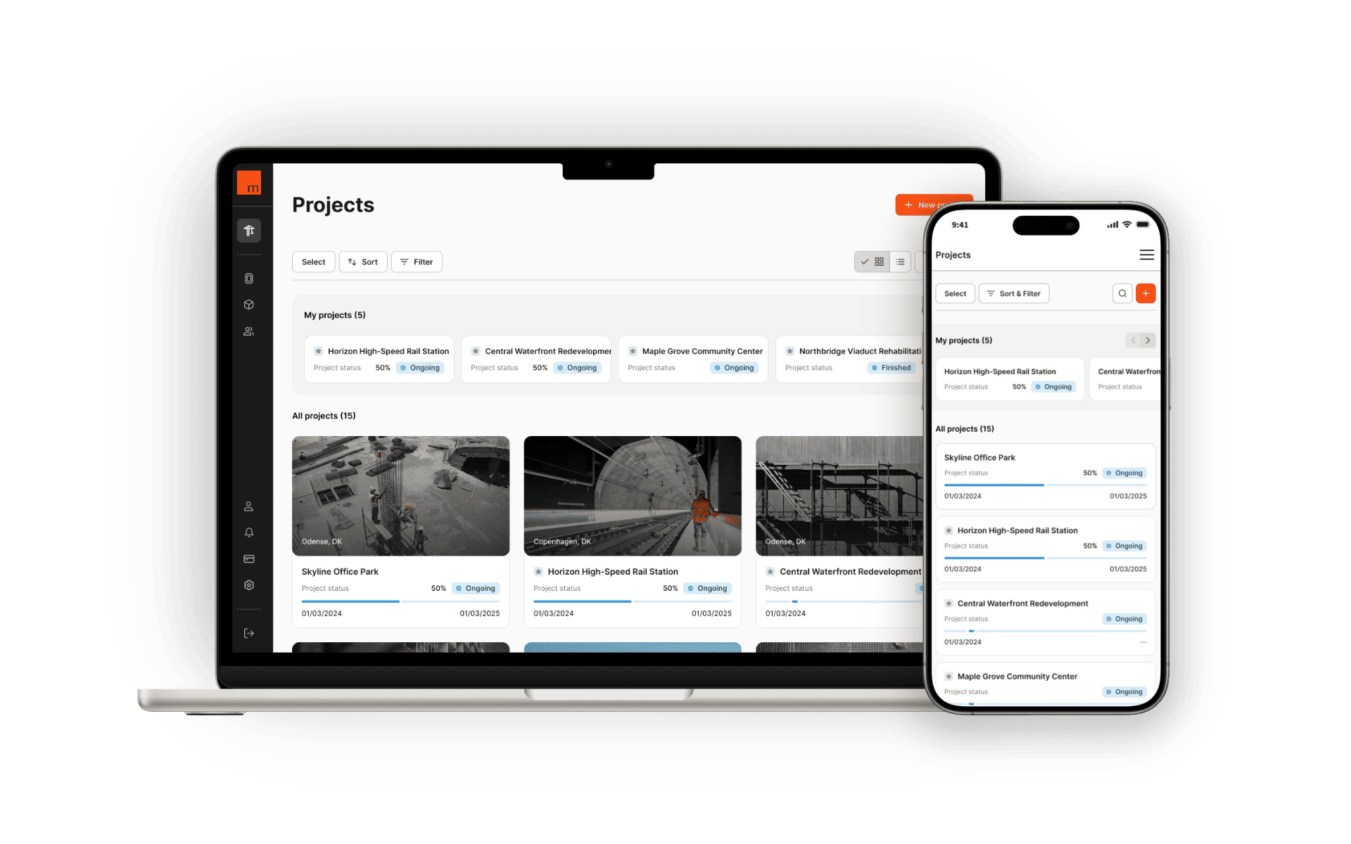
Overview as toolbox
The project overview had previously shown a summary panel and a location map. Neither was useful. I redesigned it as the entry point for project preparation. On first entry, users see an empty toolbox: resource cards, each with a direct prompt and a clear action. The cards resolve as resources are added. Users who skip the overview and go straight to creating a pour encounter the same prompts in context, within the flow. The guidance follows them rather than waiting at the start.
Wireframing and testing
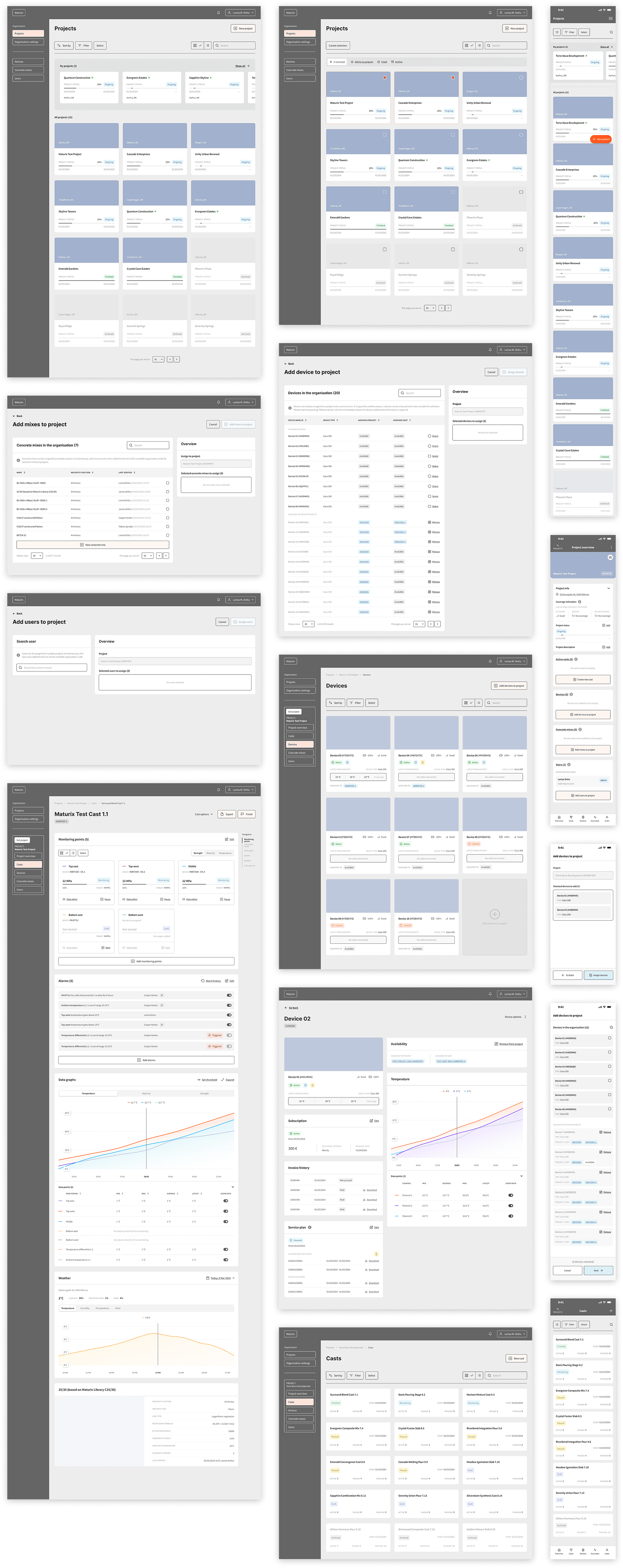
I built the wireframes in Figma at interactive fidelity, deliberately keeping them below visual design level so testing could focus on flow and structure rather than how things looked. I tested with Maturix users who had reported the platform's limitations: people who knew precisely where it failed. The flows held. Users completed setup tasks without the lateral navigation that had defined the old experience. The toolbox logic was understood without explanation.
Design system
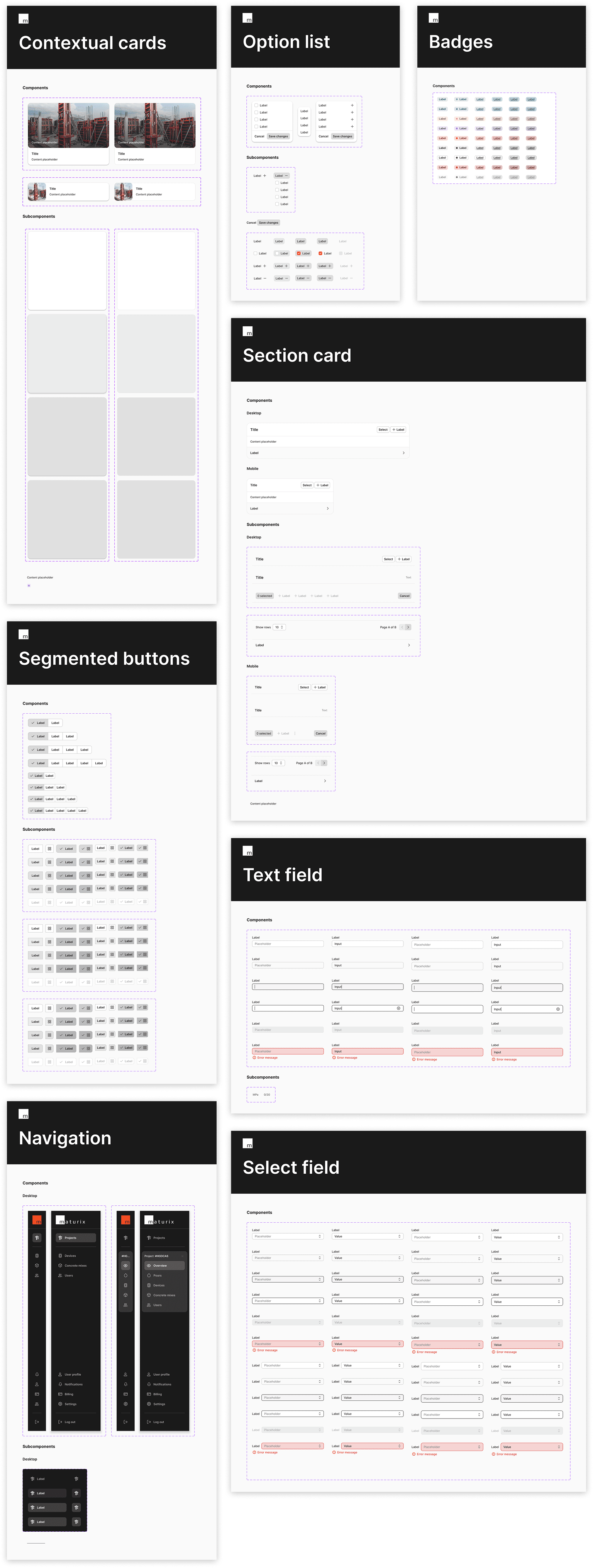
In parallel with the platform redesign, I built a design system in Figma to cover the full Maturix product family: Insitu, Nova, and any future products. The system includes a getting-started guide, a styles foundation covering typography, colour, elevation, radius, and layout breakpoints, and a full component library organised by function: actions, layout and structure, selection and input, feedback indicators, tables, lists, and navigation. Each component has a spec page covering properties, subcomponents, states, and usage values. The card system includes contextual, section, carousel, and callout cards, each with its own properties and visual states. The system was built to hand directly to the development team, reducing interpretation gaps during implementation.
Prototypes
I built the prototypes in Figma using design system components, covering the full setup flow from project entry through pour creation and monitoring point configuration. The prototypes mapped every state and transition the development team would need: what each screen contained, how resources were pulled into context, and how the flow responded when something was missing. Paired with the design system documentation, they were the reference point throughout the build.
Outcome
Users could complete a full project setup without leaving their context once. The toolbox model replaced a system that required prior knowledge with one that surfaced what was needed, when it was needed. For new users, that difference is the gap between getting started and giving up.